SERVICES
Strategy
Strategy
Strategy
Strategy
Brand Design
Brand Design
Brand Design
Art Direction
Art Direction
Art Direction
PROJECT
NOBL
NOBL
NOBL
NOBL
NOBL
An identity for change
An identity for change
An identity for change
An identity for change
An identity for change
PROJECT SUMMARY
NOBL is a management design consultancy operating at the intersection of strategy and product design. They asked us to help them bring their brand to life through an updated identity system.
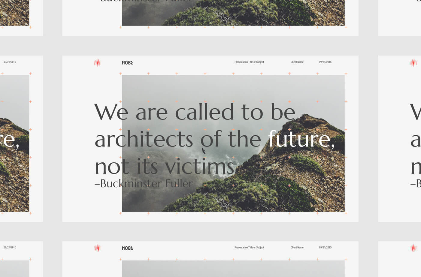
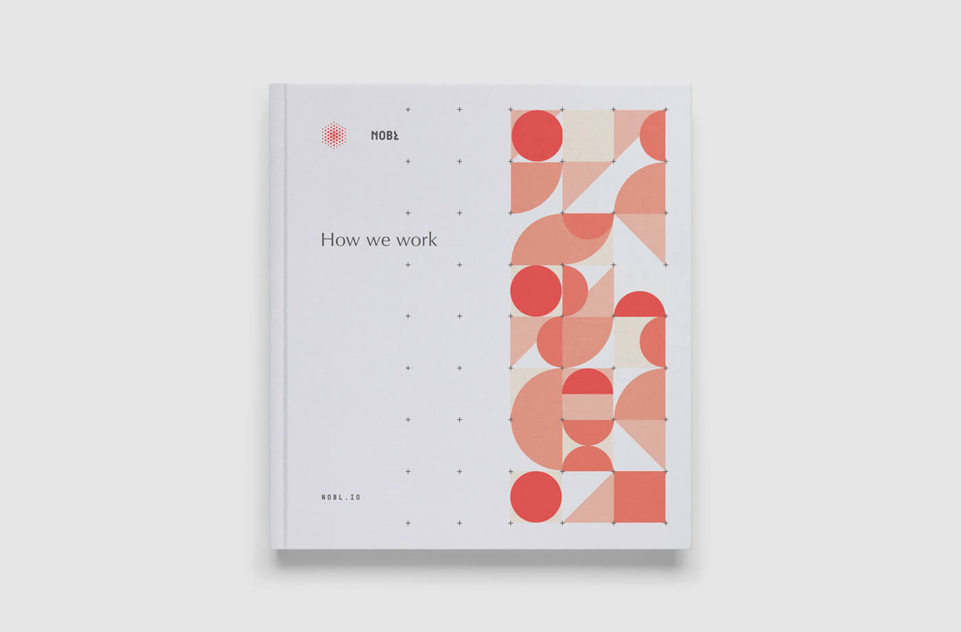
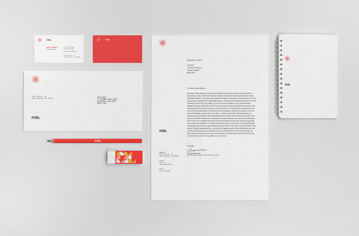
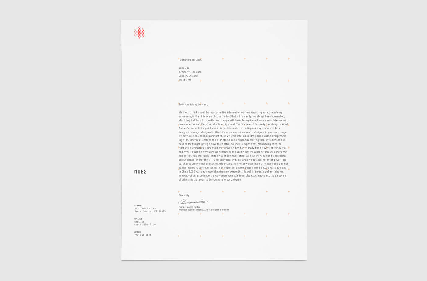
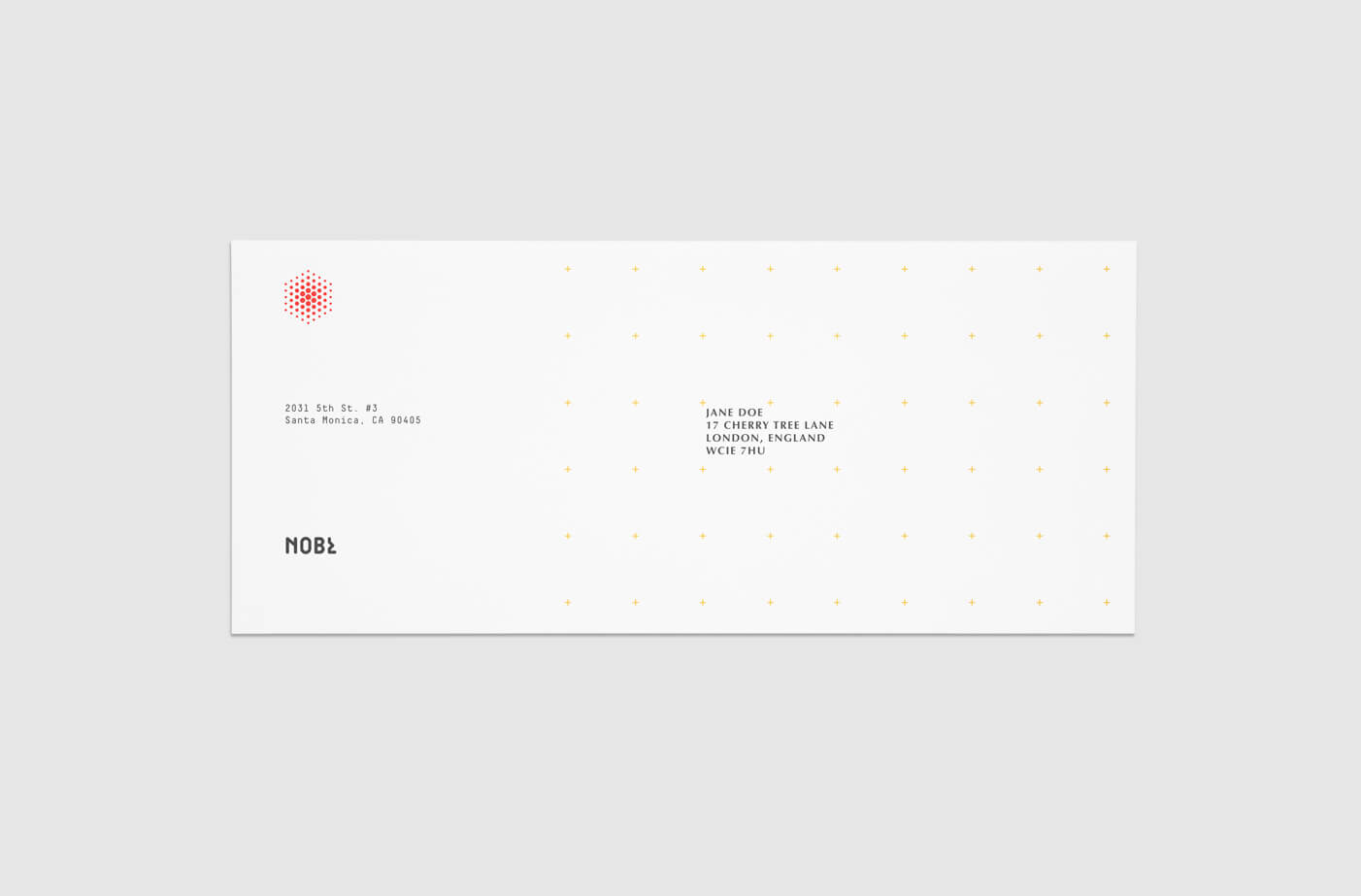
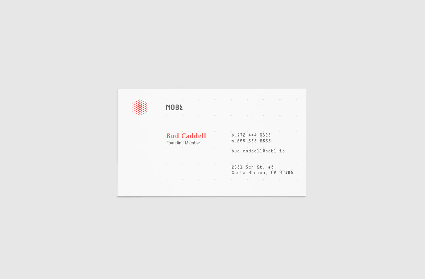
We recognized that NOBL is basically an architect of teams, processes, change and management. This led us to an idea of an open grid to be part of the visual language. It symbolizes a clean slate, the potential for something new but it also serves a very functional purpose throughout the business materials and decks as it organizes information and brings clarity. Further, it can be manipulated and abstracted to create any number of artworks or imagery and it can house a system of shapes that can be built up to create anything.
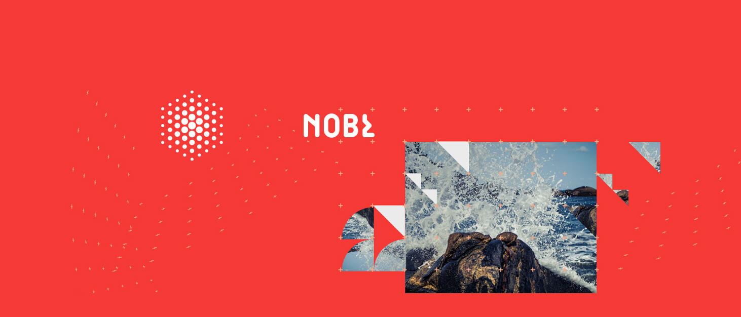
We built a living system that will continue to evolve over time and give NOBL plenty of room to experiment and reinvent while still retaining a clear and consistent voice. The NOBL logo takes inspiration from namesake and Nobel Peace Prize founder–Alfred Nobel’s past in the dynamite business. It is a spark, an explosion, a bursting forth of ideas and energy. The mark is also a cube, a building block, a unit that you can form or adapt into anything at all. The mark represents energy as well as the ability to change and build–exactly what NOBL helps teams do.
NOBL is a management design consultancy operating at the intersection of strategy and product design. They asked us to help them bring their brand to life through an updated identity system.
We recognized that NOBL is basically an architect of teams, processes, change and management. This led us to an idea of an open grid to be part of the visual language. It symbolizes a clean slate, the potential for something new but it also serves a very functional purpose throughout the business materials and decks as it organizes information and brings clarity. Further, it can be manipulated and abstracted to create any number of artworks or imagery and it can house a system of shapes that can be built up to create anything.
We built a living system that will continue to evolve over time and give NOBL plenty of room to experiment and reinvent while still retaining a clear and consistent voice. The NOBL logo takes inspiration from namesake and Nobel Peace Prize founder–Alfred Nobel’s past in the dynamite business. It is a spark, an explosion, a bursting forth of ideas and energy. The mark is also a cube, a building block, a unit that you can form or adapt into anything at all. The mark represents energy as well as the ability to change and build–exactly what NOBL helps teams do.
LOCATION
Portland, Oregon USA
Portland, Oregon USA
WORKING NOT WORKING